Themes and accessibility
Caller Karaoke uses a neutral grey interface with limited colour. The large prompt card adds a glanceable cue: green while the caller must speak the shown call now, red while the card looks ahead to the next move, and grey for ready, count-in, dancing, and completion. The label text still says CALL NOW or UPCOMING MOVE, so the fill is never the only signal.
Choose a theme
Open Preferences with the gear button in the top-right corner, find Theme, and select Light or Dark. Dark is the default.
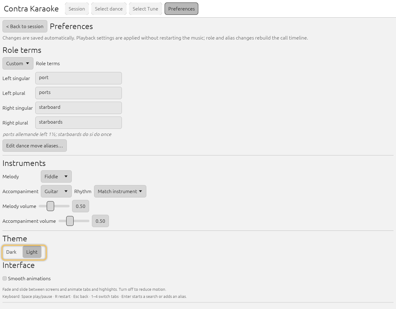
The light theme keeps the same neutral structure in a warm cream palette. Return to Session to see the chosen theme on the call screen.
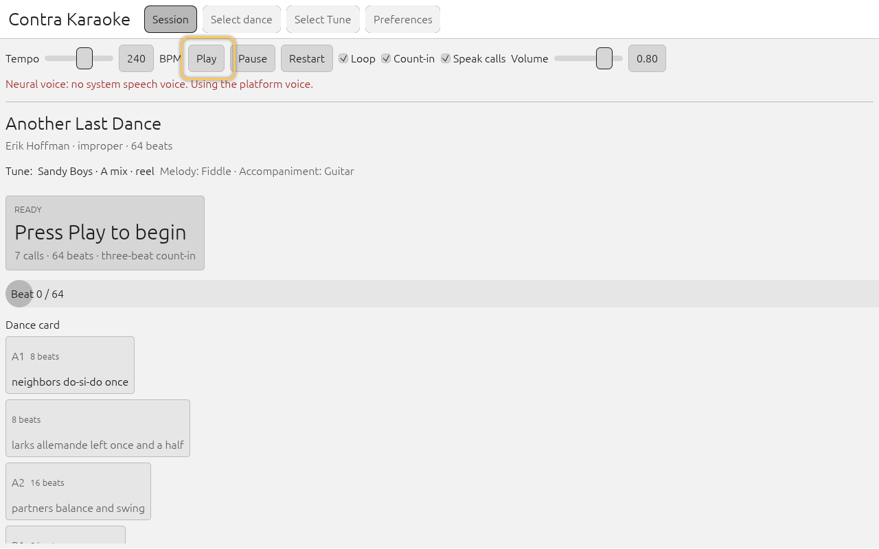
The light theme is available for bright rooms and projectors.
The light theme uses the same structure with its own warm cream palette: a
paper-toned page (#ece7d6), near-black text (#26241c), muted brown-grey
secondary text, and off-white call cards. It follows the ContraDB site's cream
background rather than pure white, which glares under stage lights. Every light
surface keeps body and muted text at 4.5:1 or better, including the Caller
Karaoke wordmark and tab labels in the header. It is intended for bright rooms
and projectors.
Interface and motion
Open Preferences with the gear button and find Appearance to turn Smooth animations on or off. The Undo and Redo buttons and the keyboard reference sit below the checkbox.
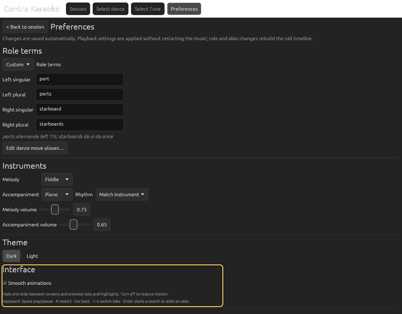
Appearance settings control theme, screen transitions, dance card spacing, the glossary, undo and redo, and the keyboard shortcuts.
Smooth animations fade and slide between screens and animate tab and highlight
changes. Turn them off to reduce motion; the app then switches screens
immediately. The docs site also respects prefers-reduced-motion.
Below those controls, Dance card padding chooses how tightly the session card packs its figures, and Show dance glossary (on by default) controls the optional dance-term reference. Turning the glossary off removes its tab, its underlined terms, definition tooltips, Glossary button, and About link altogether. See the Dance glossary for the reference itself.
Undo and Redo undo the last preference or dance/tune change and are disabled while there is nothing to undo or redo. They are full touch targets at phone width, and the same actions are on Ctrl+Z and Ctrl+Y (Ctrl+Shift+Z also redoes). Each action leaves a short status message under the buttons.
Touch and narrow windows
Every control in the phone session layout — tab, slider, transport button, and toggle — uses a 44-pixel interaction height, and the app window has a minimum size of 360×560. On a desktop every action button keeps the same 40-pixel height as the session Play button; no control is shrunk to the height of its text. Below about 640 pixels wide the Session tab switches to that phone layout: the wordmark and long tab labels give way to four short tabs beside the pinned Preferences gear, which keeps the same 44-pixel target, the tempo, caller, and band sliders use the full width, and the transport buttons split the row evenly. On a short window the whole session page scrolls so the dance card is never pushed out of reach.
Swipe left or right across empty content to change tabs on a touch screen, or use the ← and → keys with a hardware keyboard. A press that starts on a control keeps the gesture: folder rows reorder and buttons activate instead of changing tabs. A slider starts guarded, with a padlock and a rounded outline: tap it, then drag sideways to adjust the level. The guard returns when you tap or swipe anywhere outside the slider, and the page does not scroll while you are dragging an unlocked slider. On a hybrid desktop the guard follows the last input: touching the screen guards the sliders, and moving or clicking with the mouse releases them. Tab swipes are also suspended while a text field has focus, a drop-down is open, or the About window is showing.
Tapping a text field opens the system keyboard on Android and the browser. The field keeps focus while you type; Backspace, Enter, and the arrow keys belong to the field, and shortcuts such as Space and 1-4 stay suspended until it loses focus. Suggestions and autocorrect are off so typed aliases, searches, and ABC source are not rewritten.
A number box behaves the same way. The keyboard stays open while you edit a tempo, volume, or timing value, and the number applies when you press Enter or tap elsewhere. Typing is never interrupted by the field reformatting a partial value.
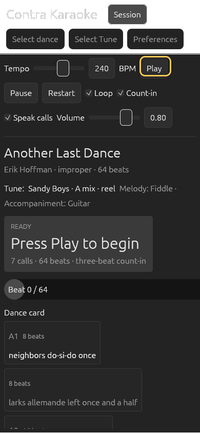
The search and download screens use the same phone layout. Form labels sit beside their controls, each field takes the remaining width, and the results and preview stack into one scrolling column instead of two narrow columns. Saved folders collapse behind a Folders summary row so the saved cards start on screen. Every button keeps the 44-pixel touch target, including the preview actions and the alias reset controls, and a saved card's body is itself one full-width target that previews that dance or tune. Folder rows are also touch targets: a tap selects the folder, while a press-and-hold lifts it for reordering and Move up / Move down offer the same change without a pointer. A desktop secondary click and a touch long press both open the same folder/delete menu for a saved item.
Keyboard
- Space plays or pauses.
- R restarts from the count-in.
- Esc returns to Session from a picker, Preferences, or the alias editor.
- 1-4 switch tabs; 5 opens Preferences.
- ← / → move to the previous or next tab.
- Enter submits a search or adds a custom alias.
- Ctrl+Z undoes the last change; Ctrl+Y or Ctrl+Shift+Z redoes it.
Shortcuts are ignored while a text field has focus, and the arrow keys stay with a focused slider or list. A focused text field keeps its own Ctrl+Z for undoing typing. On Windows, Linux, and Android, the operating system's media controls (the keyboard's play/pause key, the desktop media widget, or Android's lock screen and headset buttons) work even when another window or app is in front. See Keyboard shortcuts for details.
Screen readers and labels
The app uses egui's accessibility tree and is designed to expose control
labels, but the current UI is still being audited. Several fields (search boxes,
alias editors, and some sliders) are visually labelled without a formal
accessible-name association. Treat screen-reader support as incomplete for
0.1.0.
The documentation site itself is keyboard navigable, uses visible focus outlines, and provides alt text for every screenshot. If you find a specific unusable control, report it with the control name and screen so it can be added to the label pass.
Motion and flashing
The app does not flash or pulse the call prompt. The progress bar moves
continuously with playback. If screen transitions are distracting, turn off
Smooth animations in Preferences → Appearance. The docs site respects
prefers-reduced-motion and uses no animated screenshots.
Text-to-speech
TTS is optional and never the only way to receive a call. If no voice is available, visual calls continue. See Text to speech.
Next: Export MIDI.